
Website for business: builder or custom, what to include and design examples
Builder or custom website, the pages and features a business site in Kazakhstan needs, design examples by industry, common mistakes and a launch checklist.
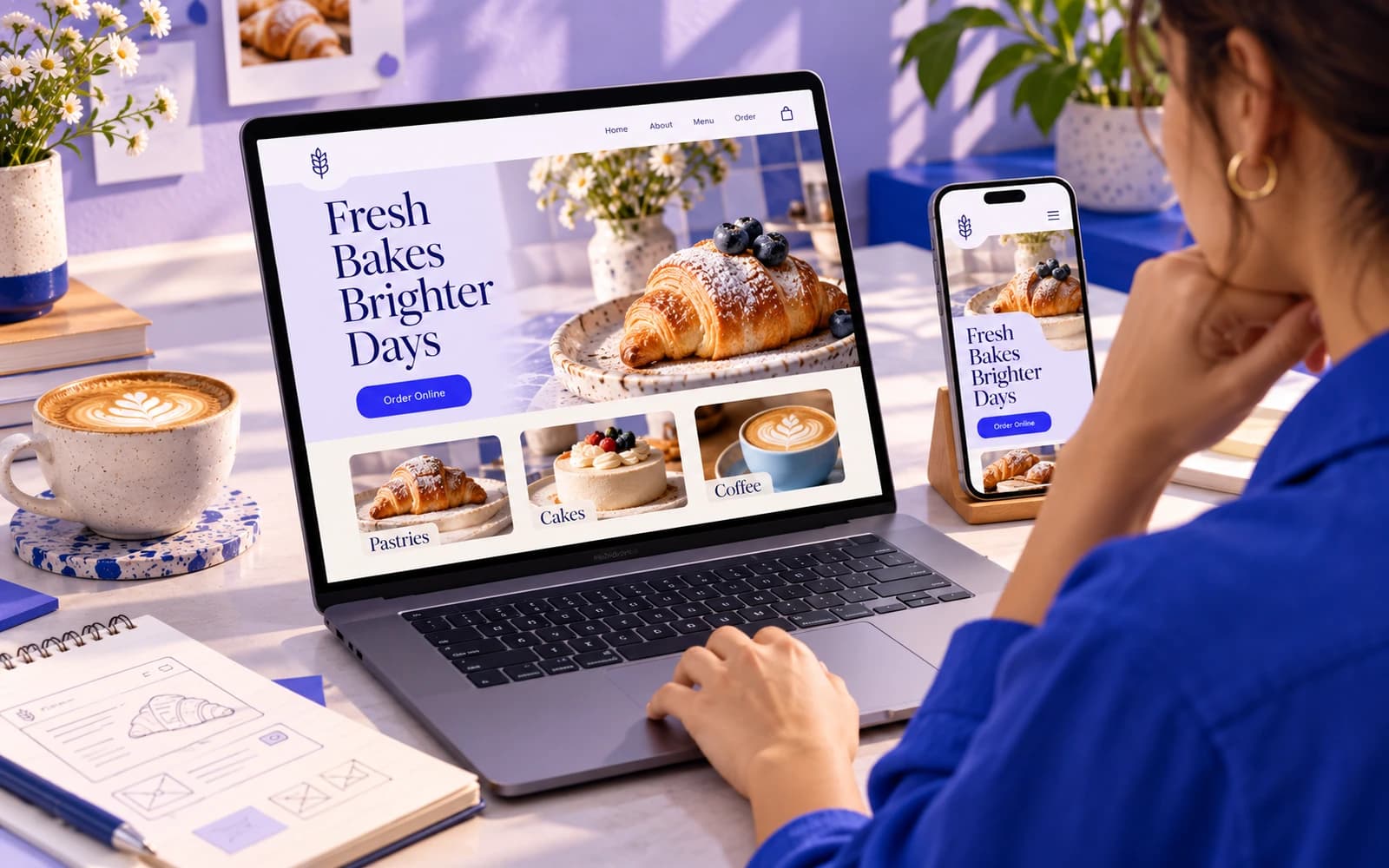
A business website has one job: help the right people understand what you do and contact you, book or buy without friction. It does not need to be big or expensive. It needs clear services, visible proof, a contact path that works on a phone and a structure that search engines can read.
The short answer to "builder or custom?" is this. If you need a few pages that rarely change, with no booking, payments or client logins, a website builder template is usually enough, and you can launch in days. If the site is where customers book, order or compare you against competitors, or it has to talk to your calendar, CRM, 1C or Kaspi, a custom build pays off because the site starts doing part of your team's work.
Below: how to choose between a builder and a custom website, the pages and features every business site needs, design examples by industry, the mistakes we see most often and a launch checklist.
Does a company need a website if it has Instagram, WhatsApp and 2GIS?
Social profiles, listings in 2GIS and Google Maps, and a store on Kaspi are useful, and you should use them. But they are rented space. The platform decides how your page looks, what it shows next to you and whether your posts reach anyone. A website is the one place you control completely.
In practice, a business website does three things other channels do poorly:
- Answers the questions people ask before they contact you: what exactly you offer, for whom, where, how it works and roughly what it costs.
- Builds trust. People check a business before calling it. A clear site with real examples and contact details is often what tips them from "maybe" to "let's ask".
- Catches demand from search. Someone searching Google or Yandex for your service in their city lands on a page that describes that service. A social profile rarely ranks for that kind of search.
Keep the 2GIS and Google listings, and link them to the site. They work best together: the listing shows up on maps and in local results, the website explains the details and takes the enquiry.
Website builder or custom website: how to choose
There are three realistic routes, and each is right for someone.
When a website builder is enough
Builders such as Tilda or Wix give you templates, hosting and an editor in one subscription. They are a good fit when:
- you need a credible presence: services, contact details, a form, maybe a gallery;
- the content changes rarely and you are happy to edit it yourself;
- you do not need logins, complex booking rules or connections to your own systems;
- the budget is small and the deadline is short.
The hidden cost is your time. Choosing a template, writing the text, preparing photos and checking every page on a phone usually takes longer than people expect. And the result will look like other sites built on the same template.
When a custom build is worth it
A custom website is designed around your services and your customers, then built and tested for you. It makes sense when:
- the site is where customers book, order or pay, so every extra step costs you orders;
- you need booking, payments, a client area or a CRM and 1C connection, and the builder's add-ons start to fight each other;
- you have several services, branches or audiences, and a template's structure does not fit;
- you have outgrown a one-page site.
The middle route: a freelancer on a template
A freelancer sets up and adapts a builder or theme template for you. It is faster and cheaper than a custom build, but you own less of the design and the structure. It works well for a simple site if you bring ready text and photos.
| Website builder | Freelancer on a template | Custom website | |
|---|---|---|---|
| Who does the work | You | Freelancer, with your content | A team: structure, design, build, testing |
| Time to launch | Days | A few weeks | A few weeks, scope agreed up front |
| Design | Template, looks like others | Adapted template | Designed around your services |
| Booking, payments, CRM | Builder's add-ons | Plugins, limited | Built or connected to your systems |
| Ongoing cost | Monthly subscription | Subscription or hosting | Hosting and support, listed in the contract |
| Best for | Very simple sites, testing an idea | A clean site with ready content | Sites that sell, book or grow with the business |
The full comparison is on our website builder vs development page, and the price of each route, with the monthly costs people forget, is in our breakdown how much does a website cost. At Pazl a business website starts from 540 000 ₸, at a price fixed in the contract.
What a business website must have
Whatever route you choose, the same basics decide whether the site brings enquiries.
The pages
- Home page. In one screen: what you do, for whom, where, and the main action (call, message on WhatsApp, book, request a quote).
- One page per main service. What it is, who it is for, how it works, what it costs or what the price depends on, and what happens after someone gets in touch. One page per service is also what lets each service be found in search.
- Proof. Project examples, before-and-after photos, certificates and licences, reviews you can show honestly. Put them next to the service they support, not only on a separate page.
- About. Real people, real photos, why you do this. Trust is built here.
- Contact. Phone, WhatsApp, Telegram, email, a short form, address and opening hours if customers visit you, and a map.
- Legal pages. A personal data policy and a consent checkbox in the enquiry form: under Kazakhstan law personal data is collected with consent and stored in a database located in Kazakhstan. What the consent must contain is explained in our guide on personal data on a website. If you sell online, add a public offer and your physical address and phone number.
The features
- A mobile layout designed, not squeezed. Most people will first see your site on a phone. Buttons large enough to tap, phone numbers that call, forms that are short.
- An easy way to get in touch. A visible button on every page. In Kazakhstan, for many businesses a WhatsApp button works better than a form.
- Prices or price guidance. "How much?" is the most common reason people call. Even "from a given amount" or "the price depends on A, B and C" saves time for both sides.
- Speed. Compressed images and a light page. A slow site loses people before they read anything.
- Search basics. A unique title and description for each page, headings that describe the content, readable addresses and a sitemap. People in Kazakhstan search on both Google and Yandex, so the site goes into both webmaster tools.
- Analytics. At least page views and the number of enquiries, so you can see which pages bring clients.
- Editing you can do yourself. Texts, prices, opening hours and projects are editable in the admin panel.
- Two languages if your customers differ. Russian and Kazakh versions with the same prices and contact details.
Add-ons when the site has to do more
Online booking, payments, an online store or a client area turn a website into a small product. Plan them as a separate phase: launch the core site first, then add, for example, online booking with reminders or accepting payments online once you see where visitors come from.
Business website design examples by industry
Good business website design is not about the most original layout. It is about putting the right information and the right action in front of the right visitor. Here is what that looks like in different fields.
Clinic or practice: prices and availability up front
Patients want to know three things: who can see them, when and for how much. A strong clinic site shows the doctors seeing patients today, lists services with prices and lets people book without a phone call. Convenient booking is three steps on one screen: branch and day, time, confirm. Behind it, the front desk sees the day's schedule in one admin screen.
Studio, gym or salon: the schedule is the home page
People come back to these sites to book, not to read. The design leads with the timetable or the booking button, describes each class or treatment in one line, and explains memberships and cancellation rules plainly.
Cafe or restaurant: menu, hours and location in one tap
The visitor is usually hungry and on a phone. Put opening hours, the address with a link to 2GIS or Google Maps, the current menu as a web page rather than a PDF, and the main action (reserve, order or call) on the first screen. Good food photos matter more here than anywhere else.
Trades and home services: trust and a fast quote
Plumbers, electricians, cleaners and builders are chosen on trust and speed. Show the areas you cover, the services with price guidance, photos of real jobs and a quote form that takes a minute. A visible phone number and WhatsApp button in the header are essential.
Professional services: expertise and a clear first step
Accountants, lawyers, consultants and agencies sell expertise, so the design should be calm and readable. Show who the service is for, what the first meeting looks like, the people behind the firm and examples of problems you have solved. An article section helps both trust and search.
High-consideration purchases: filters, comparison and a booked viewing
For real estate, cars, furniture or anything expensive, visitors compare before they contact anyone. The site needs a catalogue with filters, detailed pages and one clear action such as "book a viewing".
What good examples have in common
- The first screen says what the business does and offers one main action.
- Each service has its own page, and the price question is answered.
- Proof sits next to the claim it supports.
- The phone version is as complete as the desktop one.
- Nothing asks the visitor for more information than the next step needs.
For inspiration, look through the builders' template galleries for your industry and, above all, the sites of the five competitors that rank for your service in your city. Note what they answer on the first screen and what they leave out. That gap is your opportunity.
Common mistakes with business websites
- Writing about the company instead of the customer. "We are a dynamic team of professionals" tells a visitor nothing. "Emergency plumber in Almaty, same-day call-out, call-out price on the site" tells them everything.
- One page for all services. It is harder to read and almost impossible to find in search. Give every important service its own page.
- Hiding the contact button. If people have to scroll back to the top or look for a phone number, many will not.
- Designing for desktop first. The phone version gets checked at the end, and it shows.
- No prices at all. You do not have to publish a full price list, but some guidance filters out poor fits and brings in ready buyers.
- Launching and forgetting. Old prices, last year's opening hours and a form that goes to an ex-employee's inbox cost more enquiries than a dated design.
- Losing search traffic in a redesign. When pages move, old addresses need redirects to the new ones, or the pages that used to bring visitors stop working.
Launch checklist for a business website
- Home page says what you do, for whom and where, with one main action.
- Every main service has its own page with price guidance.
- Phone, WhatsApp and a short form work on a phone.
- Real photos and project examples, not only stock images.
- Personal data policy and a consent checkbox in the enquiry form.
- Unique title and description on every page; sitemap submitted to Google Search Console and Yandex Webmaster.
- Analytics installed and enquiries counted.
- Site linked from your 2GIS and Google listings and social profiles.
- Test enquiry sent from a phone and received by the right person.
- Someone on your team owns updates: prices, hours, news.
When to bring in a web design team
If your site has to explain several services, take bookings or connect to the tools your team already uses, it is worth having it planned, designed and built for you. Pazl builds business websites: service sites, landing pages and redesigns, at a fixed price from 540 000 ₸ with a six-month warranty, and the code and access stay with you. If a builder template covers your case, we will tell you so.
What we do on this topic
Short and to the point.
How many pages does a business website need?
Usually five to ten: a home page, one page per main service, an about page, a page with examples or reviews, a contact page and the legal pages. Start with what visitors need to decide, and add pages as your services grow.
Is a website builder good enough for a company?
For a simple site that rarely changes, yes. A builder becomes limiting when you need booking, payments, a client area or connections to 1C, a CRM and Kaspi, or when the template structure no longer fits your services.
What makes good business website design?
A first screen that says what you do and offers one clear action, a separate page for each service, proof next to your claims, price guidance and a phone layout that is as complete as the desktop one.
How long does it take to build a business website?
On a builder, from a few days to a couple of weeks if your text and photos are ready. A custom site takes longer because it includes structure, design and testing. We launch the first version in a few weeks, with the scope and price fixed in the contract before work starts.
Can I start with a builder and move to a custom website later?
Yes, and many companies do. When you move, keep a list of your current pages and set up redirects from the old addresses to the new ones, so you keep the visitors that search engines already send you.
How much does a business website cost?
With us it starts from 540 000 ₸: a landing page, a service site or a redesign. The final figure depends on pages, features and languages, and we fix the price in the contract.
Read also
 Websites12 min readHow much does a website cost in Kazakhstan? An honest price breakdownWhat drives website cost in Kazakhstan: builder, freelancer or studio, design, languages and integrations, monthly running costs and how to get a quote you can compare.
 Websites9 min readWhen a landing page cannot keep up: leads get lost and processes fall into chaosA landing page is a great start, but as a company grows it becomes a bottleneck: leads get lost, statuses live in WhatsApp, growth hits headcount. When to move on.
 Websites11 min readHow to accept payments online in Kazakhstan: cards, Kaspi, invoices and chatbotsOnline payments in Kazakhstan: links and invoices, Halyk ePay on your site, Kaspi, chatbot payments, online cash registers, 1C and CRM sync, mistakes and a launch plan.
Shall we discuss your project?
We will tell you what it costs and how long it takes. The price is fixed in the contract.